Fonts and lines
How do I create a QR code?
FLYERALARM QR code specifications for best results Colour mode We recommend designing the QR code in 100 % black on…
FLYERALARM QR code specifications for best results
Colour mode
We recommend designing the QR code in 100 % black on a white background, or in negative white on a 100 % black background, to ensure optimum contrast.
Resolution
We prefer QR codes created as vector graphics. For image formats we recommend a minimum resolution of 300ppi.
Size
For QR codes we recommend a minimum size of 2 x 2 cm.
Material
When selecting the material please be aware that certain materials, in particular open ones such as mesh fabrics, may reduce the readability of the QR code.
Surfaces
Positioning QR codes on tapered or curved surfaces may severely reduce their readability.
Minimum line thickness
Please consult the general print specifications when selecting line thickness for QR codes.
Protective zone
We recommend creating a protective zone around the QR code, which is at least as wide as 4 QR code modules, in order to avoid problems with scanning.
Compatibility with scanners
The readability of the QR code may depend on the quality and specifications of the scanner used. For this reason we cannot guarantee readability on all scanners.
Changes after print
Changes to the QR code after print - such as varnish, damage or changes in shape, may affect their function.
Validity of information
We cannot take any responsibility for how current or correct the information linked via QR code is. Checking this information is the responsibility of the user.
764 views
Posted
1 year
ago
by
josephine
What is meant by font height?
The font height, also called “x-height”, is the total height of small letters without extending parts above or below the…
The font height, also called “x-height”, is the total height of small letters without extending parts above or below the mean line of a font.

The letter “m” is very suitable for measuring most fonts, because you can put the ruler directly to the left stem.
594 views
Posted
1 year
ago
by
josephine
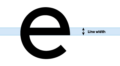
How do I measure the line thickness?
Measure the thinnest point of the design, e.g. in fonts the horizontal line of the small “e” or contours of…
Measure the thinnest point of the design, e.g. in fonts the horizontal line of the small “e” or contours of logos.

523 views
Posted
1 year
ago
by
josephine
What should I keep in mind when adding fonts and lines?
Fonts Font size To ensure good readability of your printed product, do not use font sizes smaller than 6 points…
Fonts
Font size
To ensure good readability of your printed product, do not use font sizes smaller than 6 points (2.1 mm). Attention: The respective font size depends on the font. It is possible that different fonts will look differently-sized at the same point size. Information on specific requirements can be found in the data sheet for the respective product.
Fonts in a PDF
Please ensure that all text elements are embedded in your print file. Fonts are normally embedded automatically after the PDF export. If this is not the case, you should convert your text to paths. We generally recommend converting all texts to paths.
Lines
General line thicknesses
- Positive lines (dark lines on bright backgrounds) must have a minimum thickness of 0.25 points (0.09 mm)
- Negative lines (light lines on dark backgrounds) must have a minimum thickness of 0.5 points (0.18 mm)

Line weights must also not fall below the specified dimensions when reducing the file size. Specific information and requirements can be found in the data sheet for the relevant product.
482 views
Posted
1 year
ago
by
josephine


