- +971 (04) 3309200
- Mo-Fr from 9am to 6pm


Data format and bleed
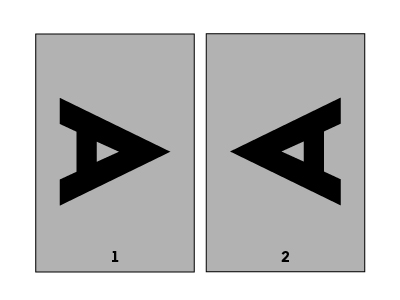
I can only order portrait sizes, but I need my product in landscape size. Where do I align the pages?
Please first of all, check once more if there is really no suitable alignment available in the configurator. The following…
Please first of all, check once more if there is really no suitable alignment available in the configurator. The following approach should only be necessary in exceptional cases:
The key point is “head-to-head”. If the head of the design is seen on the first page on the right, it must be seen on its back page on the left. If front and back pages are shown side by side in the chosen alignment, they are positioned head-to-head and will be correctly printed.
373 views
Posted
2 years
ago
How do I find the bleed or safety distance in the data sheet?
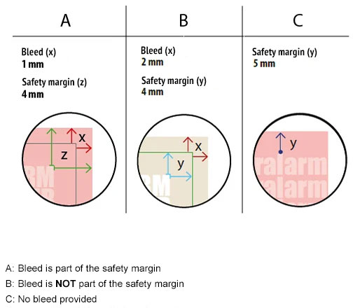
The safety distance is measured from the finished format inwards and sets the requirement of how near you can place…
The safety distance is measured from the finished format inwards and sets the requirement of how near you can place important elements. The bleed is measured to the exterior and can be used to overfill colour areas beyond the edges. Attention: In some data sheets there is no bleed or it is already part of the safety distance!
479 views
Posted
2 years
ago
How are the dimensions of a PDF file defined?
Important: trim box, bleed box, PDF/X-3:2002 A PDF file can contain different page boxes. These are the media box, crop…
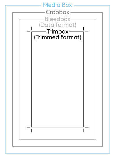
Important: trim box, bleed box, PDF/X-3:2002
A PDF file can contain different page boxes. These are the media box, crop box, bleed box (=file format) and trim box (=finished size). The bleed box and trim box are mandatory components of the PDF/X-3:2002 standard, which we require for print files. The trim box ensures that the file is correctly placed.
Mediabox
This defines the dimensions of the output medium and the media frame of the PDF document. At this stage the document is not yet cut and generally contains the PostScript page dimensions configured in the PDF generator. The media box is automatically the largest of all of the boxes since it encompasses all other boxes listed below. When creating your print files, you should ensure that the crop box and bleed box are the same size as the media box.
Cropbox
The crop box (also known as the screen region in Adobe Acrobat) describes the region of a PDF page that is output on the screen or by the printer. By default it is set to the same dimensions as the media box.
Bleed box (file format)
The bleed box region contains information about the cut region that defines the size of the finished format plus the specified bleed area. At FLYERALARM a 1 mm bleed on each side is normally required. You can always find the individual requirements in the data sheet.
Example: A 1 mm bleed must be added on all sides of a DIN A4 (21 x 29.7 cm) page, resulting in a width of 21.2 cm (21 cm + 2 mm) and a length of 29.9 cm (29.7 cm + 2 mm). These are the dimensions that must be configured for the bleed box. By default it is set to the same dimensions as the crop box.
Trimbox (same as the FLYERALARM finished size)
The trim box defines the finished size of the print product after trimming – i.e. what you hold in your hand at the end of the print process.
1430 views
Posted
2 years
ago
How do I correctly choose the file format and bleed in my print file?
Please create your print file using the exact specifications from the data sheet. This contains parameters specific to the product…
Please create your print file using the exact specifications from the data sheet. This contains parameters specific to the product concerned, such as safety distance and bleed.
The file size matches the size of the finished product plus the bleed and is always dependant on the respective product.
The bleed is the area of the print file that extends beyond the finished size. The bleed exists to make sure that surfaces and photos, which should be visible up to the edge are really printed until the edge. This way, there are no white streaks or edges, even if the material is not 100 % precisely cut off. The bleed is printed beyond the finished size and then cut. The print files should therefore be bigger and bled-off elements should be expanded to the bleed.
The safety margin is an area within the finished size that should generally not contain any design elements. This is to avoid any elements being cut off partially or completely when cutting the print product.
For elements that are to be printed up to the edge, the safety distance does not need to be observed.
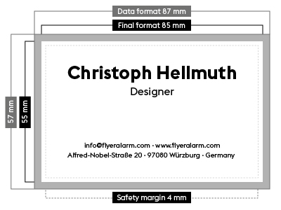
This example relates to a business card with a finished size of 8.5 x 5.5 cm. A bleed of 1 mm per side is added to the file. This means that the file dimensions are 8.7 x 5.7 cm. Please also note the product-specific safety distance for texts and objects from the edge of the file. In this example, these are 4 mm from the edge of the file format.
Printers’ marks
Please do not create any printers’ marks such as folding, trim, punching or cutting marks in your file – they will be printed along with the artwork.
Page alignment and sequence
Is everything in the correct location? Always check the alignment (portrait or landscape format) of your design and that any multi-page products have the pages in the correct order. Additional product-specific information can be found in the relevant data sheet.
835 views
Posted
2 years
ago
File types and PDF requirements
What are vector files and why is my image not accepted?
Vector files are, unlike raster files, made from geometric curves, therefore razor-sharp and can be differentiated from its surroundings at…
Vector files are, unlike raster files, made from geometric curves, therefore razor-sharp and can be differentiated from its surroundings at every zoom level.
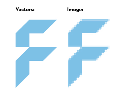
This property is a basic requirement for many print techniques, e.g. screen print, embroidery and cut contours. File names of vector files usually end in .ai/.eps/.svg and with a suitable program they can be saved as vector based PDF files in the right format for printing.
503 views
Posted
2 years
ago
What should I keep in mind for print files created in image editing software?
The fundamental rules for print files created in image processing software are: Please send us artwork that has been created…
The fundamental rules for print files created in image processing software are:
- Please send us artwork that has been created in image processing software such as Adobe Photoshop or Affinity Photo as TIF or JPG files
- Please flatten layers to the background
- Do not use alpha channels
- Do not use clipping paths
- Save TIF files without compression, with interleaving
- Please set JPG files to maximum quality and baseline (standard)
However, if you still wish to supply your artwork as a PDF file, please use the PDF/X-3 standard
538 views
Posted
2 years
ago
Which file type is required at FLYERALARM?
Please provide a JPG, PDF or TIFF file. For specific products and finishes only PDF files will work. Other file…
Please provide a JPG, PDF or TIFF file. For specific products and finishes only PDF files will work. Other file formats are not accepted. In the related data sheet, you can find all information on the right file type for your product.
PDF requirements
Please create PDF files using the PDF/X-3:2002 standard.
General requirements for PDF files for printing:
- PDF version 1.3
- Always convert text to paths
- High quality/resolution
- Do not add comments or form fields
- Do not encrypt the file (e.g. password protection)
- Do not add OPI comments
- Do not add transfer curves
In addition, you should observe the following:
- Please flatten transparencies
- Always make corrections to page alignment in the design software or original application
- Do not rotate PDF files in viewer programs (such as Acrobat Reader)
- Do not create patterns, shadows or coloured tiled patterns
1117 views
Posted
2 years
ago
Colour
How do I prevent blue areas from being printed in violet?
You can avoid a print with too much Magenta by working with the correct colour profile right from the start…
You can avoid a print with too much Magenta by working with the correct colour profile right from the start and by keeping the Cyan-Magenta-ratio at a difference of at least 20 %, e.g. C:100 M:80 Y:0 K:0
In general: the higher the colour difference, the better the colour reproduction in the printing process.
485 views
Posted
2 years
ago
What is overprinting?
When using overprinting the colour values of the overprinted object are added to those of the object underneath. This function…
When using overprinting the colour values of the overprinted object are added to those of the object underneath. This function is primarily used for black text to avoid blank streaks against coloured backgrounds.
When the overprint function is enabled, the background appears through the foreground colour. The text is printed on top of the background and with a slight plate offset no blank streaks are visible. The overprint function should be deactivated for white objects, because these objects will “disappear”.
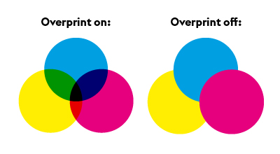
Black areas that fully or partially obscure other objects are also problematic as different black values may arise depending on the underlying layer. Overprinting may be used as an “effect” (e.g. a shadow, by overprinting a light grey area). For some products with finish, e.g. partial varnish, the overprint function must be activated. Product-specific information can be found in the relevant data sheet.
455 views
Posted
2 years
ago
How do I create the correct black mix?
We recommend that black and grey objects such as text and lines are created using pure black.Example: Cyan 0 %,…
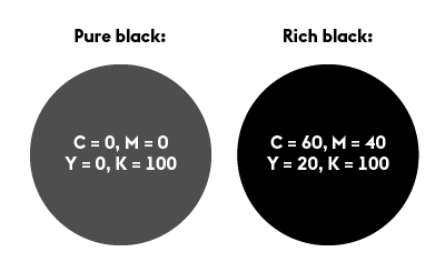
We recommend that black and grey objects such as text and lines are created using pure black.
Example: Cyan 0 %, Magenta 0 %, Yellow 0 %, Black 60 % or Cyan 0 %, Magenta 0 %, Yellow 0 %, Black 100 %)
Deep black
Regions of black ink can be created by adding in another colour component.
Example: Cyan 60 %, Magenta 40 %, Yellow 20 %, Black 100 %. Depending on your requirements, different ink proportions can be added until the maximum coverage of the product is achieved. This is not recommended for text and lines since slight gaps may occur.
547 views
Posted
2 years
ago
What is the difference between process colours and full-tone colours?
Process colours (CMYK) In traditional four-colour printing, colours are produced by mixing cyan, magenta, yellow and black. We recommend: The…
Process colours (CMYK)
In traditional four-colour printing, colours are produced by mixing cyan, magenta, yellow and black. We recommend: The print files you supply should be created purely in CMYK. Colour variations may occur when using full-tone colours (including with alternative CMYK colour spaces), NChannel, DeviceN colour spaces, Lab or RGB colour spaces.
Full-tone colours (e.g. HKS, PANTONE)
A spot colour (also known as a special colour), is a premixed ink. The advantage of a full-tone colour is that it allows colours that cannot be created purely by the four-colour process to be printed. Two well-known producers of full-tone inks are HKS and PANTONE. Some of our products can be printed with a HKS colour (e.g. letterheaded paper 2/0 2/1 colours).
637 views
Posted
2 years
ago
Why is a colour file needed?
When sending print files, always include a colour profile when saving the print file. To obtain the best results, please…
When sending print files, always include a colour profile when saving the print file. To obtain the best results, please use the profile ISO Coated V2 (ECI) for our advertising products. For any other products, please use the “ISO Coated V2 300%” (ECI) profile. As part of our internal colour management process, your print file will be optimised and produced within the PSO standard according to the selected printing medium. If your colours have been created in an alternative colour space, variations may occur.
467 views
Posted
2 years
ago
What should I keep in mind when adding colours?
Colour mode The CMYK colour space is used when printing, while the RGB colour space is used on the screen.…
Colour mode
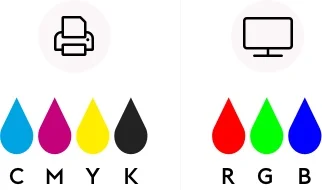
The CMYK colour space is used when printing, while the RGB colour space is used on the screen. Therefore we require your print files in CMYK. Please avoid using Device-N colour spaces or Nchannel, because these might lead to wrong interpretations in our workflow.

Colour profile
- ISO Coated v2 300% (ECI)
- For advertising products and posters (digital print): ISO Coated v2 (ECI),
- Additional information about ICC profiles from ECI can be found at eci.org.
- The colour profile must be configured as an output intent in the PDF file.
Total ink application
- Total ink application is between 10 % and 300 %
- For deviations specific to a product you can find the requirements in the related data sheet.
Special colours
- Do not use special or spot colours in full-colour printed products (4/0 or 4/4 colour print) and do not use alternative colour spaces. Special colours in this case will be automatically converted to CMYK, which could result in errors in colour replication.
- More detailed information on products with special colours can be found in the relevant data sheet.
Text
- Texts and fine lines must always be created in pure black.
(example: Cyan 0 %, Magenta 0 %, Yellow 0 %, Black 60 % or Cyan 0 %, Magenta 0 %, Yellow 0 %, Black 100 %) - More information on text elements can be found in the category “fonts and lines”
859 views
Posted
2 years
ago
Resolution
What resolution is required for printing?
The resolution is specified in ppi (pixel per inch). In general: the higher the ppi, the sharper the print output.…
The resolution is specified in ppi (pixel per inch). In general: the higher the ppi, the sharper the print output. Please keep in mind that there might be a loss of quality, when recalculating a resolution. The ppi alone is therefore not always the decisive factor when it comes to quality. The important part is that the print file is visually sharp.
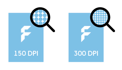
Our recommended resolution:
- Sizes smaller than A2: 300 to 356 ppi
- Sizes from A2 and bigger: 100 to 150 ppi
For large size print products, which are not viewed up close (e.g. outdoor advertising) you can choose a ppi of 95.
For some products, you must create your print file with a significantly higher ppi. Information on specific resolution can be found in the data sheet for the respective product.
When in doubt, our customer service will happily consult you based on your print files.
605 views
Posted
2 years
ago
Fonts and lines
How do I create a QR code?
FLYERALARM QR code specifications for best results Colour mode We recommend designing the QR code in 100 % black on…
FLYERALARM QR code specifications for best results
Colour mode
We recommend designing the QR code in 100 % black on a white background, or in negative white on a 100 % black background, to ensure optimum contrast.
Resolution
We prefer QR codes created as vector graphics. For image formats we recommend a minimum resolution of 300ppi.
Size
For QR codes we recommend a minimum size of 2 x 2 cm.
Material
When selecting the material please be aware that certain materials, in particular open ones such as mesh fabrics, may reduce the readability of the QR code.
Surfaces
Positioning QR codes on tapered or curved surfaces may severely reduce their readability.
Minimum line thickness
Please consult the general print specifications when selecting line thickness for QR codes.
Protective zone
We recommend creating a protective zone around the QR code, which is at least as wide as 4 QR code modules, in order to avoid problems with scanning.
Compatibility with scanners
The readability of the QR code may depend on the quality and specifications of the scanner used. For this reason we cannot guarantee readability on all scanners.
Changes after print
Changes to the QR code after print - such as varnish, damage or changes in shape, may affect their function.
Validity of information
We cannot take any responsibility for how current or correct the information linked via QR code is. Checking this information is the responsibility of the user.
764 views
Posted
2 years
ago
What is meant by font height?
The font height, also called “x-height”, is the total height of small letters without extending parts above or below the…
The font height, also called “x-height”, is the total height of small letters without extending parts above or below the mean line of a font.
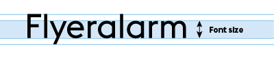
The letter “m” is very suitable for measuring most fonts, because you can put the ruler directly to the left stem.
594 views
Posted
2 years
ago
How do I measure the line thickness?
Measure the thinnest point of the design, e.g. in fonts the horizontal line of the small “e” or contours of…
Measure the thinnest point of the design, e.g. in fonts the horizontal line of the small “e” or contours of logos.
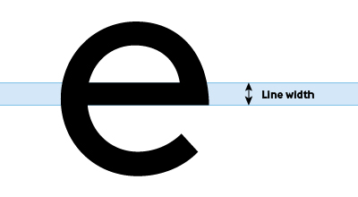
523 views
Posted
2 years
ago
What should I keep in mind when adding fonts and lines?
Fonts Font size To ensure good readability of your printed product, do not use font sizes smaller than 6 points…
Fonts
Font size
To ensure good readability of your printed product, do not use font sizes smaller than 6 points (2.1 mm). Attention: The respective font size depends on the font. It is possible that different fonts will look differently-sized at the same point size. Information on specific requirements can be found in the data sheet for the respective product.
Fonts in a PDF
Please ensure that all text elements are embedded in your print file. Fonts are normally embedded automatically after the PDF export. If this is not the case, you should convert your text to paths. We generally recommend converting all texts to paths.
Lines
General line thicknesses
- Positive lines (dark lines on bright backgrounds) must have a minimum thickness of 0.25 points (0.09 mm)
- Negative lines (light lines on dark backgrounds) must have a minimum thickness of 0.5 points (0.18 mm)
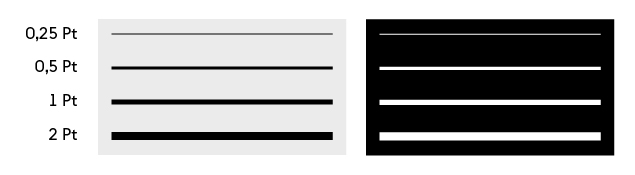
Line weights must also not fall below the specified dimensions when reducing the file size. Specific information and requirements can be found in the data sheet for the relevant product.
482 views
Posted
2 years
ago
Print data and design service
Why is my logo or other parts of the design in the colour magenta?
Every section shown in magenta has been added as a special colour and shows the finish of the product. We…
Every section shown in magenta has been added as a special colour and shows the finish of the product. We leave out the special colour in your print review while your print file contains it.
412 views
Posted
2 years
ago
What are vector files and how do I recognize them?
Vector files are mathematically defined images, that are made up of points. Unlike pixel graphics or raster files, vector graphics…
Vector files are mathematically defined images, that are made up of points. Unlike pixel graphics or raster files, vector graphics can be infinitely scaled without affecting the resolution. Vector files are especially important for realising large print products.
You can recognize vector files by their file type. The most common vector file types are:
- AI = short for Adobe Illustrator Example file type: Logo_weiß.ai
- EPS = Encapsulated PostScript is an older vector graphic format. Example file type: Logo_weiß.eps
- PDF = Portable Document Format is a vector format used for exchanging documents. Example file type: Logo_weiß.pdf
- SVG = Scalable Vector Graphics-Format is based on XML and especially suited for web applications. Example file type: Logo_weiß.svg
Attention! Vector files can contain placed pixel files, which means that they don’t contain 100% vectors only.
It is best if you send us all your vector files, so that we can check them.
1934 views
Posted
2 years
ago
Why can’t I use my logo or my file for all of the products?
Our products have different requirements due to technical and production related reasons. Thereby not every file can be used for…
Our products have different requirements due to technical and production related reasons. Thereby not every file can be used for every product.
Especially for large sized print products and print products with a higher resolution vector files are necessary. For print products in small sizes such as business cards pixel images can also be used. For finishes and engravings we also require vector files to add full-tone colours.
It is best if you send us all your files, so that we can check them.
410 views
Posted
2 years
ago
Tips & Tricks
Artwork guidelines - What should I pay attention to for the best results?
It is important to follow certain requirements to achieve the best results. We compiled helpful explanations for you in the…
It is important to follow certain requirements to achieve the best results.
We compiled helpful explanations for you in the following categories in our help section.
455 views
Posted
2 years
ago
What should I keep in mind when using mandatory information?
A strong contrast for the mandatory information must be chosen and shape, size or position of the information should otherwise…
A strong contrast for the mandatory information must be chosen and shape, size or position of the information should otherwise not be changed/edited.
449 views
Posted
2 years
ago
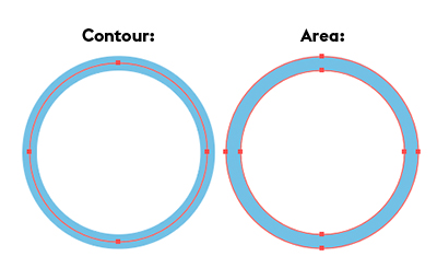
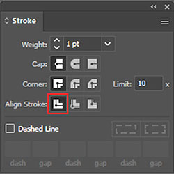
My cut contour is shown as a surface. What did I do wrong?
To prevent the cut contour from being displayed as a surface in the PDF file, please align it in the…
To prevent the cut contour from being displayed as a surface in the PDF file, please align it in the centre.
422 views
Posted
2 years
ago
I can only create RGB files with my software. Can I still use my files for printing?
Yes, the files will automatically be converted to the print colour profile after the upload, which could however cause smaller…
Yes, the files will automatically be converted to the print colour profile after the upload, which could however cause smaller colour deviations.
Attention: Products, for which full-tone colours have to be added do not work with RGB colours. Please pay attention to the chosen colour mode in the configuration when you order.
587 views
Posted
2 years
ago
How do I keep the file size as small as possible - without a loss of quality?
Work with a colour depth of 8 bit instead of 16 bit Use vectors instead of images Use the PDF/X:3…
- Work with a colour depth of 8 bit instead of 16 bit
- Use vectors instead of images
- Use the PDF/X:3 format to reduce transparencies
- Reduce your designs to one layer (if possible)
- Use masks
- Delete elements outside of the design area
- Limit the resolution to 356 ppi
471 views
Posted
2 years
ago
How do I reduce the colour application of images/vector files?
Various approaches are possible: For vectors, you can reduce the colour mix until the sum goes below the desired colour…
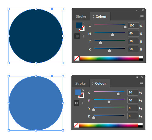
Various approaches are possible: For vectors, you can reduce the colour mix until the sum goes below the desired colour application. For images, you have to use relevant filter functions such as reducing saturation or coverage, increase brightness and/or use an already limited colour profile.
Example: The blue tone is manually reduced from 230 % colour application (100/60/20/50) to 130 % colour application (80/50/0/0).
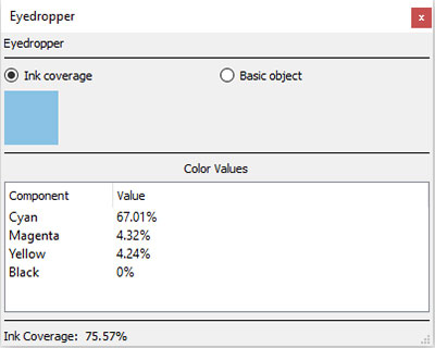
In most graphics programme you can use the eyedropper tool to check the colour application retrospectivetly.
564 views
Posted
2 years
ago
How do I check which areas are transparent in my PDF file?
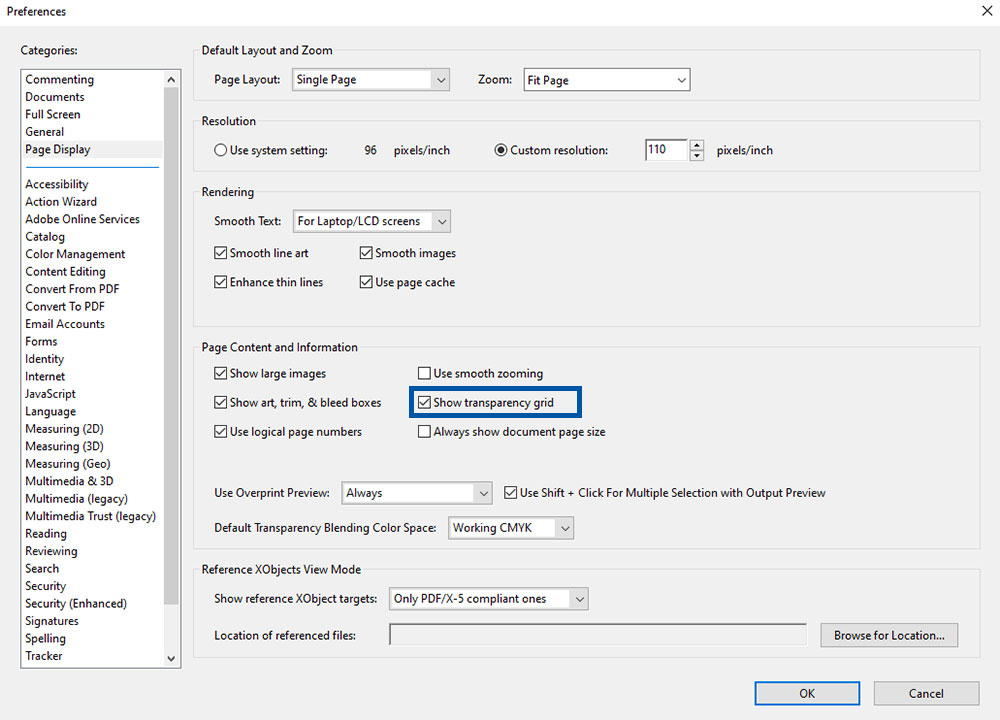
In the Adobe Acrobat Reader or Adobe Acrobat Pro you have the option to show a transparency grid. You can…
In the Adobe Acrobat Reader or Adobe Acrobat Pro you have the option to show a transparency grid. You can find it under the menu option Edit > Settings > Categories: Page view > check the box at “show transparency grid”
1954 views
Posted
2 years
ago
