- +971 (04) 3309200
- Mo-Fr from 9am to 6pm


Colour
How do I prevent blue areas from being printed in violet?
You can avoid a print with too much Magenta by working with the correct colour profile right from the start…
You can avoid a print with too much Magenta by working with the correct colour profile right from the start and by keeping the Cyan-Magenta-ratio at a difference of at least 20 %, e.g. C:100 M:80 Y:0 K:0
In general: the higher the colour difference, the better the colour reproduction in the printing process.
485 views
Posted
2 years
ago
What is overprinting?
When using overprinting the colour values of the overprinted object are added to those of the object underneath. This function…
When using overprinting the colour values of the overprinted object are added to those of the object underneath. This function is primarily used for black text to avoid blank streaks against coloured backgrounds.
When the overprint function is enabled, the background appears through the foreground colour. The text is printed on top of the background and with a slight plate offset no blank streaks are visible. The overprint function should be deactivated for white objects, because these objects will “disappear”.
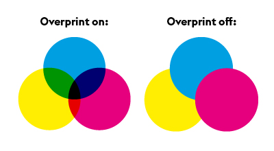
Black areas that fully or partially obscure other objects are also problematic as different black values may arise depending on the underlying layer. Overprinting may be used as an “effect” (e.g. a shadow, by overprinting a light grey area). For some products with finish, e.g. partial varnish, the overprint function must be activated. Product-specific information can be found in the relevant data sheet.
455 views
Posted
2 years
ago
How do I create the correct black mix?
We recommend that black and grey objects such as text and lines are created using pure black.Example: Cyan 0 %,…
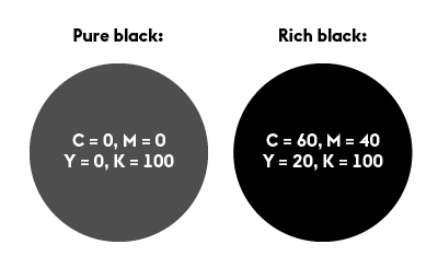
We recommend that black and grey objects such as text and lines are created using pure black.
Example: Cyan 0 %, Magenta 0 %, Yellow 0 %, Black 60 % or Cyan 0 %, Magenta 0 %, Yellow 0 %, Black 100 %)
Deep black
Regions of black ink can be created by adding in another colour component.
Example: Cyan 60 %, Magenta 40 %, Yellow 20 %, Black 100 %. Depending on your requirements, different ink proportions can be added until the maximum coverage of the product is achieved. This is not recommended for text and lines since slight gaps may occur.
547 views
Posted
2 years
ago
What is the difference between process colours and full-tone colours?
Process colours (CMYK) In traditional four-colour printing, colours are produced by mixing cyan, magenta, yellow and black. We recommend: The…
Process colours (CMYK)
In traditional four-colour printing, colours are produced by mixing cyan, magenta, yellow and black. We recommend: The print files you supply should be created purely in CMYK. Colour variations may occur when using full-tone colours (including with alternative CMYK colour spaces), NChannel, DeviceN colour spaces, Lab or RGB colour spaces.
Full-tone colours (e.g. HKS, PANTONE)
A spot colour (also known as a special colour), is a premixed ink. The advantage of a full-tone colour is that it allows colours that cannot be created purely by the four-colour process to be printed. Two well-known producers of full-tone inks are HKS and PANTONE. Some of our products can be printed with a HKS colour (e.g. letterheaded paper 2/0 2/1 colours).
637 views
Posted
2 years
ago
Why is a colour file needed?
When sending print files, always include a colour profile when saving the print file. To obtain the best results, please…
When sending print files, always include a colour profile when saving the print file. To obtain the best results, please use the profile ISO Coated V2 (ECI) for our advertising products. For any other products, please use the “ISO Coated V2 300%” (ECI) profile. As part of our internal colour management process, your print file will be optimised and produced within the PSO standard according to the selected printing medium. If your colours have been created in an alternative colour space, variations may occur.
467 views
Posted
2 years
ago
What should I keep in mind when adding colours?
Colour mode The CMYK colour space is used when printing, while the RGB colour space is used on the screen.…
Colour mode
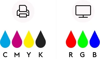
The CMYK colour space is used when printing, while the RGB colour space is used on the screen. Therefore we require your print files in CMYK. Please avoid using Device-N colour spaces or Nchannel, because these might lead to wrong interpretations in our workflow.

Colour profile
- ISO Coated v2 300% (ECI)
- For advertising products and posters (digital print): ISO Coated v2 (ECI),
- Additional information about ICC profiles from ECI can be found at eci.org.
- The colour profile must be configured as an output intent in the PDF file.
Total ink application
- Total ink application is between 10 % and 300 %
- For deviations specific to a product you can find the requirements in the related data sheet.
Special colours
- Do not use special or spot colours in full-colour printed products (4/0 or 4/4 colour print) and do not use alternative colour spaces. Special colours in this case will be automatically converted to CMYK, which could result in errors in colour replication.
- More detailed information on products with special colours can be found in the relevant data sheet.
Text
- Texts and fine lines must always be created in pure black.
(example: Cyan 0 %, Magenta 0 %, Yellow 0 %, Black 60 % or Cyan 0 %, Magenta 0 %, Yellow 0 %, Black 100 %) - More information on text elements can be found in the category “fonts and lines”
859 views
Posted
2 years
ago
